A very brief plotly introduction for beginners
In this documentation, we will be covering the basics of plotly. Plotly is a Python library used for visualizing big datasets. We will be exploring nearly all the graphic representations available by plotly.
Importing modules
We will start by importing plotly.
Line Plots
2-Dimensional
2-D line plots are generally to visualize simple datasets. The data is represented by a line or more. Line plots frequently help evaluate stock markets. Let us create one using python.
We have to start by uploading a dataset first. Fortunately, plotly has some inbuilt sets for us. Let us import the stocks dataset, that contains details about the stock prices of several major companies.
Let's plot the graph.
# labels are the titles for respective axes.
graph.show()
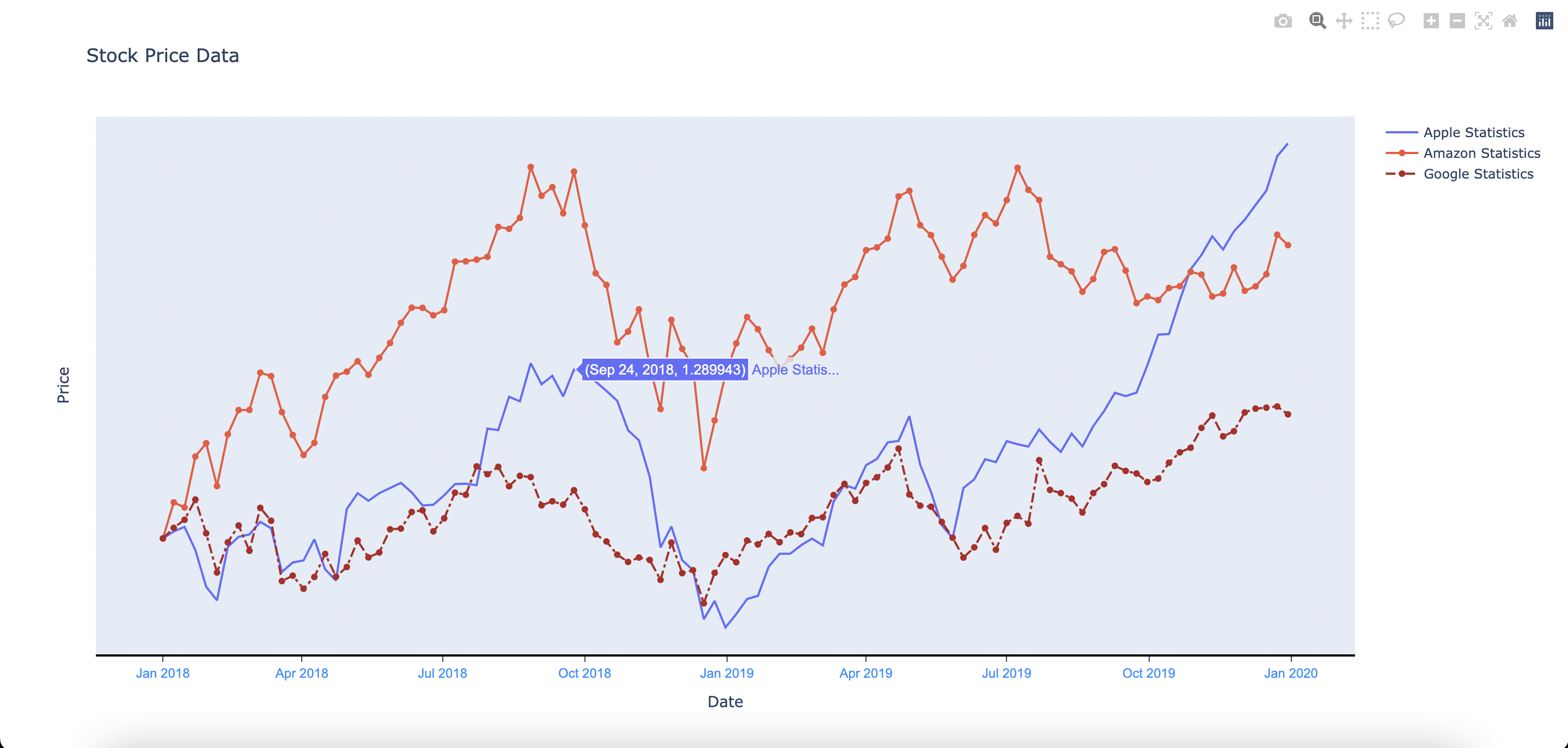
On running the program, you will find a similar graph. Specific data gets displayed by hovering over a point, as shown in the image above. Here, we can precisely monitor the price of stocks at a given date.
For a more detailed explanation, visit my docs at this link.